Scope
- Color
- Illustration
- Logo design
- Illustration
- Logo design
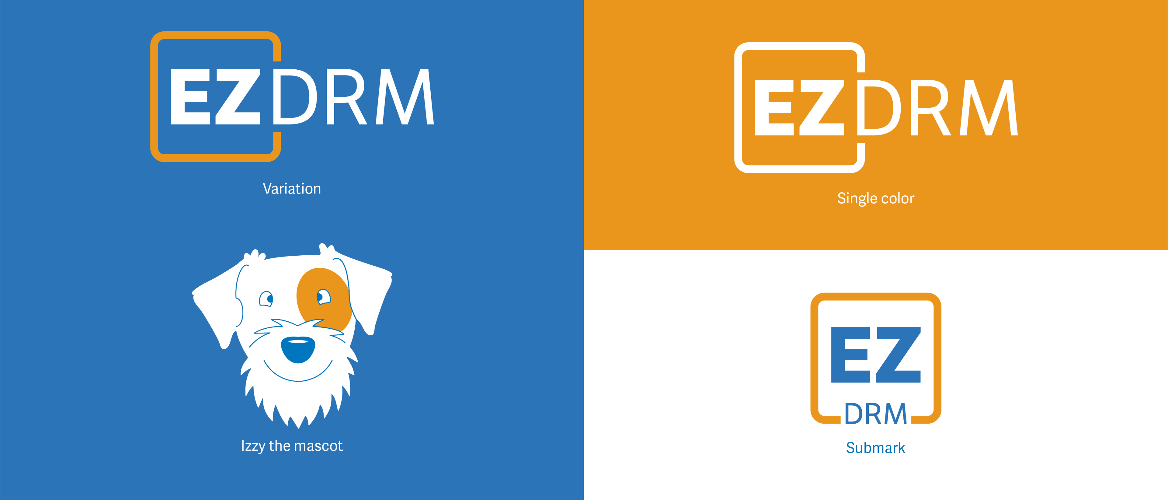
Established in 2003, EZDRM was the first company in the cloud-based digital rights management services space. They provide solutions that enable companies to securely deliver video content. While their previous logo served the company well for 15 years and was recognized in the industry, EZDRM wanted a new, modern look.
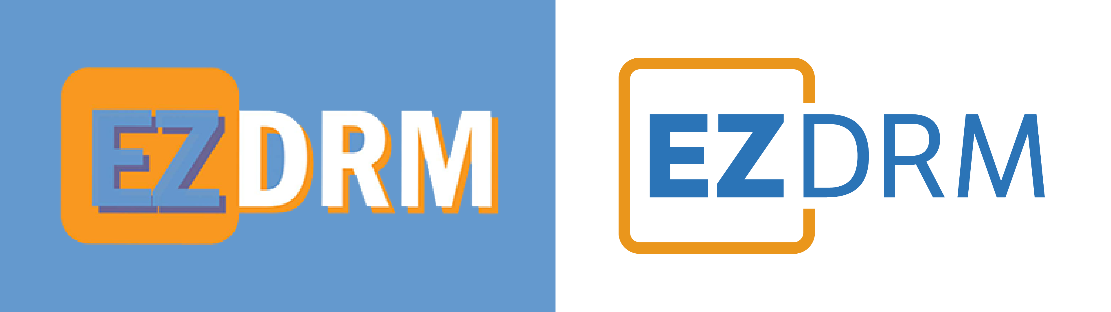
Old logo and new
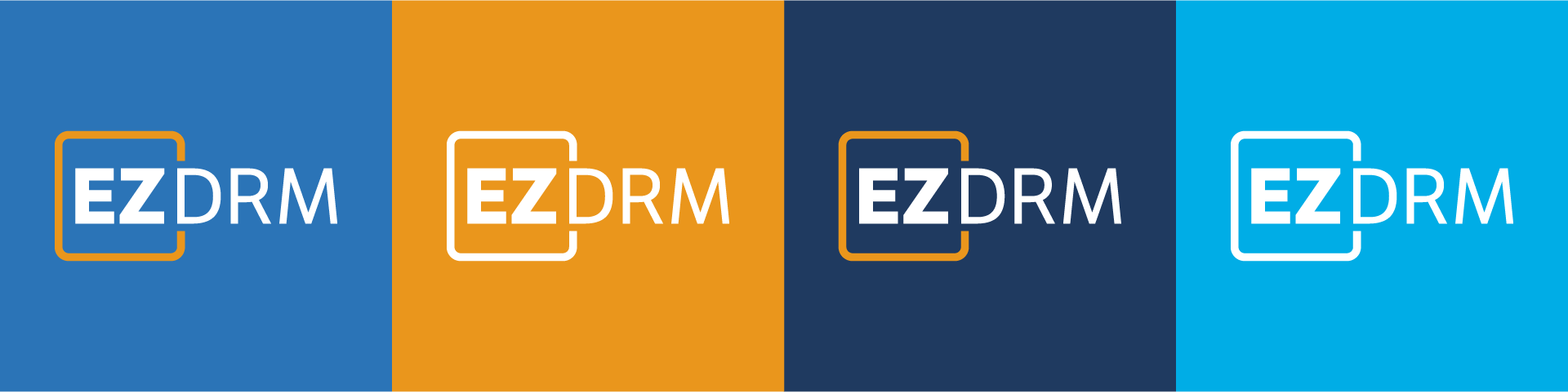
Colors
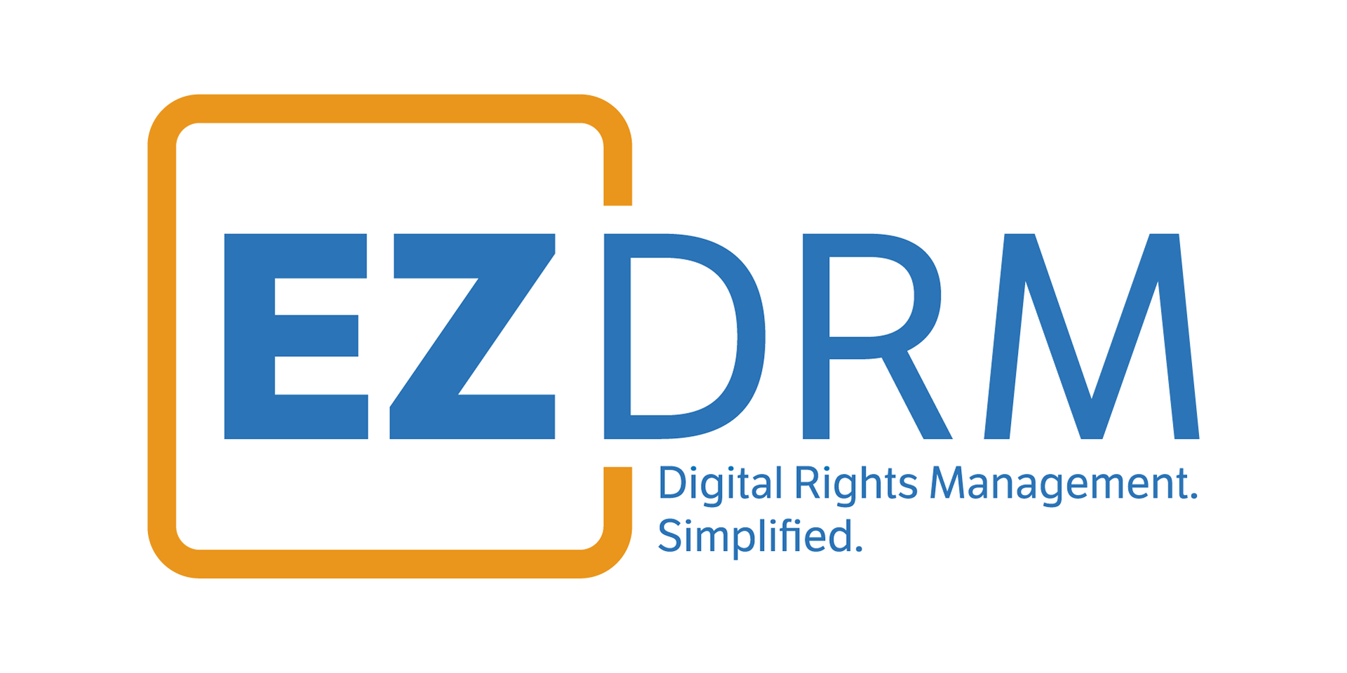
EZDRM invited me to develop a new logo and color scheme. Our goal was to refresh and modernize the brand identity without sacrificing brand recognition or confusing current customers and partners. We wanted the new logo to be simple and memorable, to exhibit professionalism and reinforce EZDRM's position as a leader in the industry. But we also wanted the logo to come across as personable. The folks at EZDRM are friendly and great to work with, their services are easy to understand and set up, and we wanted the logo to reflect that.
To accomplish this we:
- Created a design that is intentionally similar to the form of the current logo, for the purposes of retaining brand recognition. A similar key shape is used, but it’s subtle and simplified to create a clean and modern look. I removed the drop shadow to ensure the logo is versatile and can be used on light and dark backgrounds.
- Selected a new font and colors that are bold and bright.
- Brought to life a new signature brand character, to bring an element of lightheartedness to company communications.
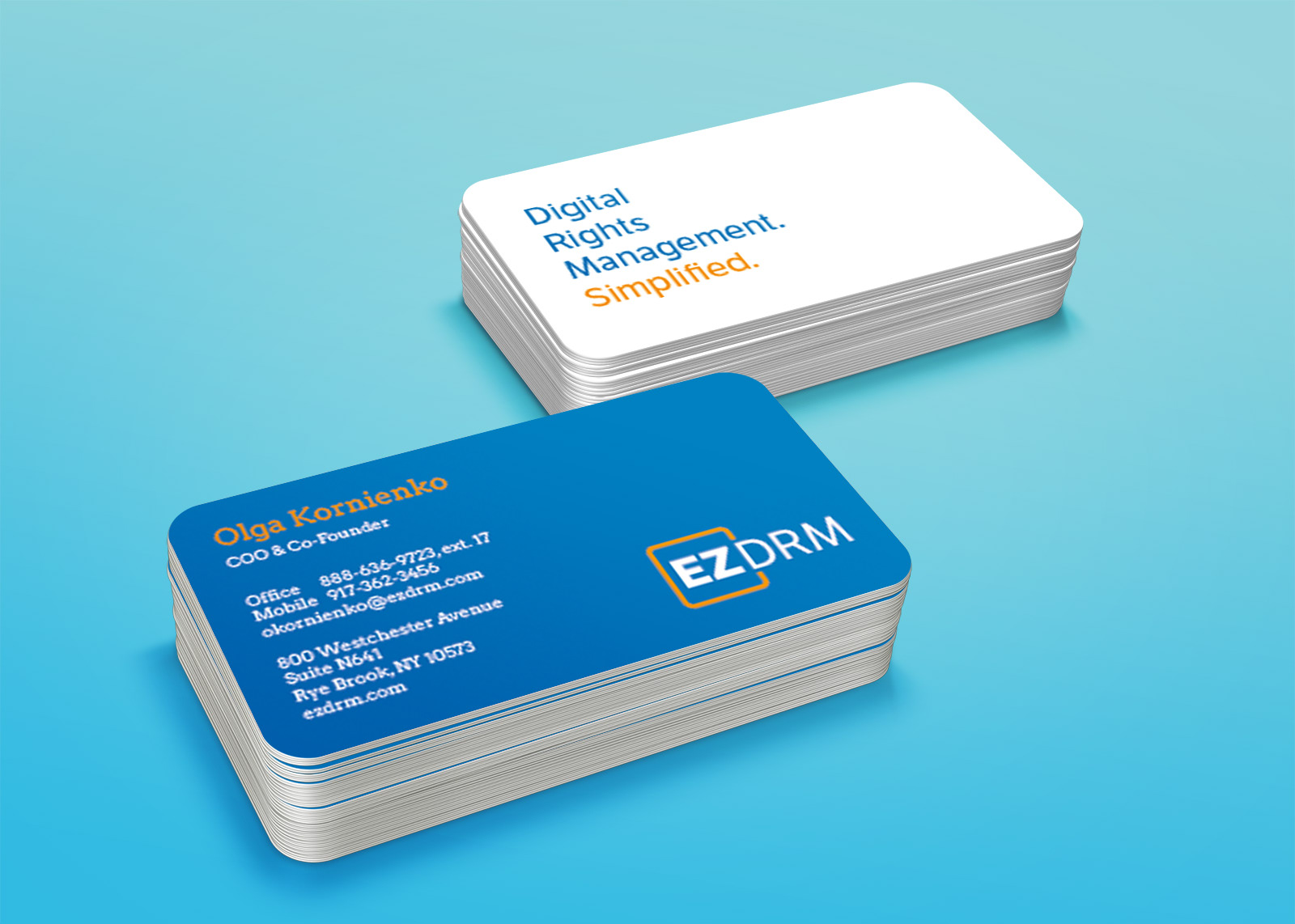
- Created a variation of the logo to be used on EZDRM's social media profiles.
EZDRM launched their new logo to positive feedback at IBC 2018 in Amsterdam. Check out their website and learn about all the services they offer.